A tight deadline can be good at forcing you to make decisions. In the weeks before I released Episode One, two of my many deadlines were selecting a title and making a cover image. I missed the title deadline. I thought the title would be obvious when I narrowed my choices to two. I slept on it for a couple days, but neither emerged as the clear choice. I needed more context before I could make a decision.
My cover image deadline was looming. Even though it meant more work, I decided to make two variations on the cover idea I had, one for each title. Whichever cover looked the best would win. And I would stay on schedule. Two birds, one stone. I thought I had outsmarted my own indecision.
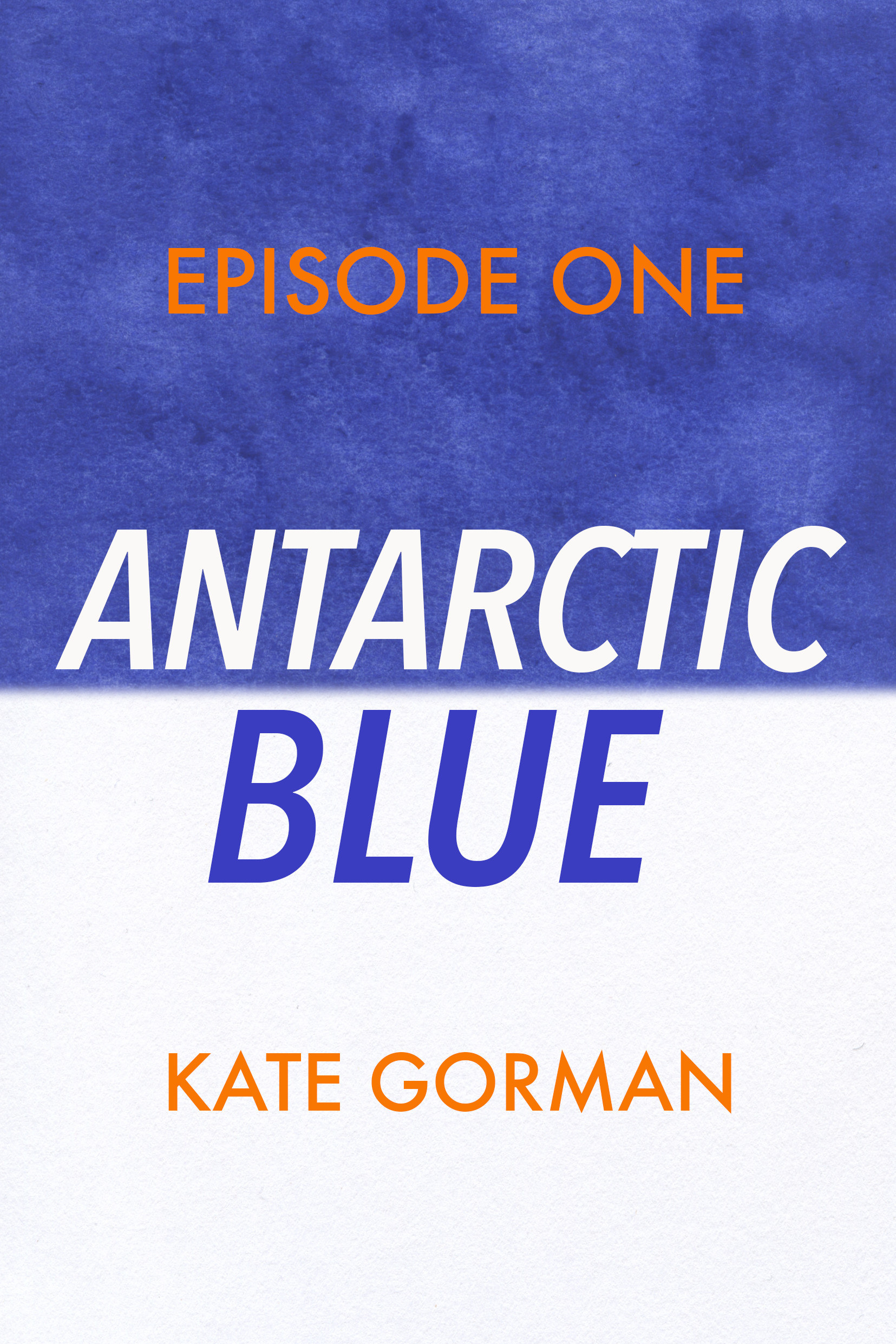
Here they are:

When I finished them, I couldn’t decide. I parked thumbnails of each cover on my desktop, figuring that eventually one of them would stand out. That didn’t happen the next day. Or the next. By now it was Saturday, and I had planned to post the first episode by Sunday. I really needed to make the decision.
Matt and I went for a walk. He was giving me some final feedback on my edits of the first two episodes, and I was feeling very resistant to his suggestions. So I thought walking would help me hear his ideas and keep the discussion rolling better. After his more specific feedback, Matt talked about how the novel included a lot on the relationships between the characters and their interior interpretations of those relationships, features that were not necessarily a big part of a standard sci-fi or thriller novel. He didn’t see it as a bad thing, it just made my book different. His comment made me assess the visual elements of the cover titles more closely, and try to relate them to who I thought would want to read the book.
The Antarctic Blue cover has a stronger “thriller” look to it. The italicized title is definitely something I’ve seen on spy or crime novels. To me, the text placed that close to the horizon line made the cover more intense, like everything was right on the edge.
The On the Ice cover is quieter by comparison. The larger expanse of the blue shows off more of the watercolor detail, and the wider spacing between the letters echoes that space. This cover points to the vastness of Antarctica and leaves a lot more to the imagination.
I realized that the On the Ice cover actually did a better job of conveying the tone of my novel. Even if I wanted to attract the standard thriller audience, it wouldn’t be a great plan to promise one kind of book with the cover graphics, and leave them with a different one when they started reading it.
Having two covers to choose from felt like the wrong move at first, giving me more choices at a time I was suffering from decision fatigue. But it actually turned out for the better. The process made me think more about who I thought the audience for the book was, which can only help me down the line.
