I am not a graphic designer. The goal is to make a cover that is more attractive and striking than a blank white rectangle with the title in Times New Roman. I’ve got a few ideas for a cover, but sometimes the only way to see if an idea will work out is to try it.
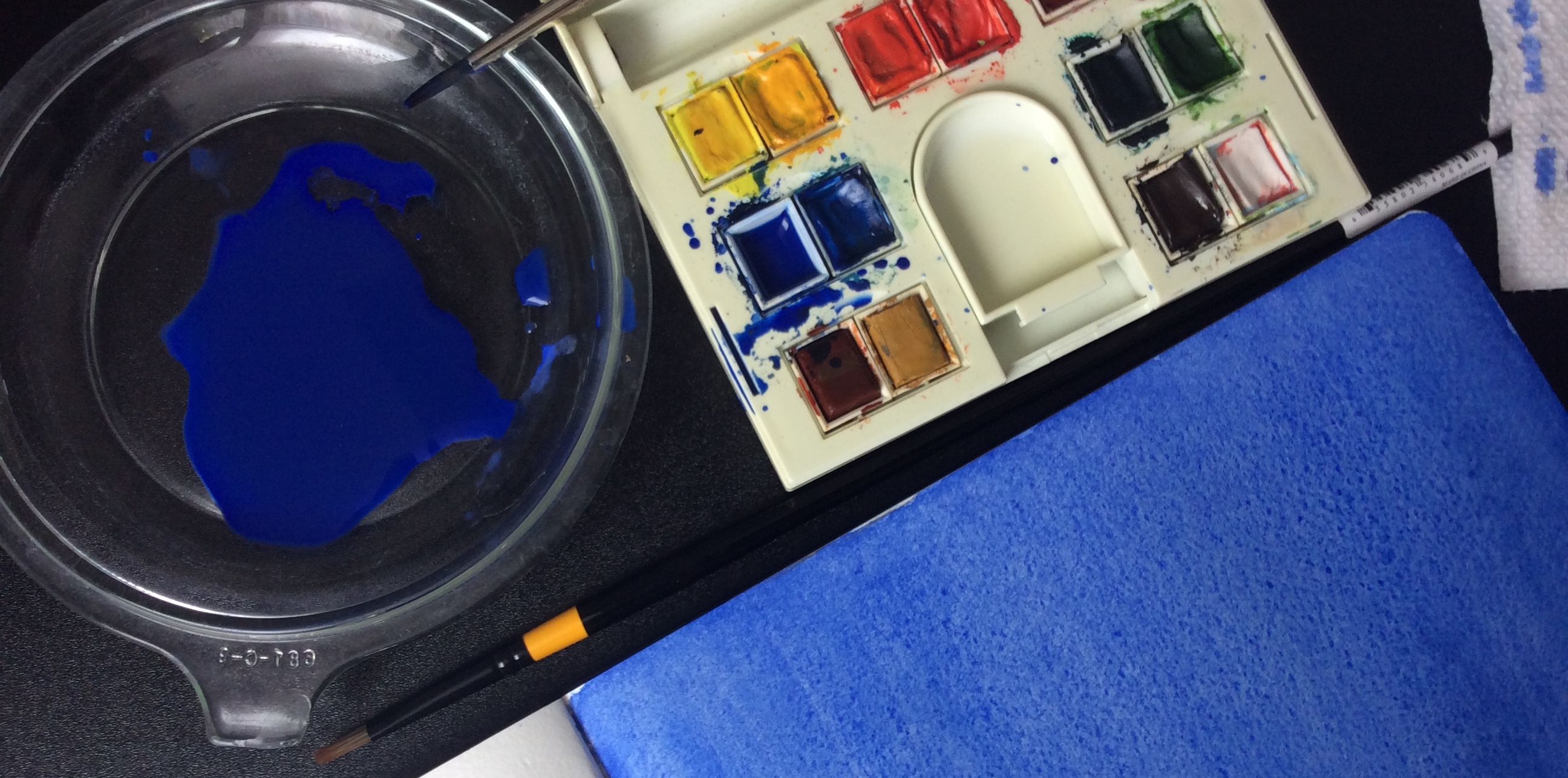
Today’s challenge was to remember how to do a flat wash in watercolor. I hadn’t done a proper one since I took art classes in a nice lady’s garage when I was in the fifth grade. So I pulled out an old travel watercolor set and used up every last bit of my ultramarine pigment to try and approximate an artistic rendering of the deep blue of a polar sky. It’s just going to be background, but I’m hoping the texture of the paper and the paint wash makes it more interesting than a solid even slab of digitally extruded color. I’ll be dusting off ancient Photoshop skills tomorrow after I scan in the blue field.
There are currently two titles in the running. I think its going to come down to which cover idea associated with the title looks better. It’s not the most poetic way to make the decision, and I’m learning to live with that. Otherwise, I’d stew over the selection for another few months instead of just getting the thing out there.
